Move fast, fix things: we’re updating the Navigation Bar in the Celonis EMS!
As they say, the world spins so fast that standing still is the same as going backwards. At Celonis, we’re always looking for ways to take small steps that make big things possible for our customers.
In this blog post, we’d like to share two updates we’ve made to the Navigation Bar in the Celonis Execution Management System user interface. These improvements introduce a faster, more intuitive way for users to navigate through the EMS, so you can focus on what matters most: creating value and maximizing business performance.
Here’s what’s changing.
Easier access: The Navigation Bar has moved from the top of the screen to the left side
More intuitive taxonomy: Some services linked from the NavBar have been renamed and regrouped
Watch a video walkthrough of these changes here:
New EMS Navigation Bar (celonis.com) Our Navigation Bar finds its new home
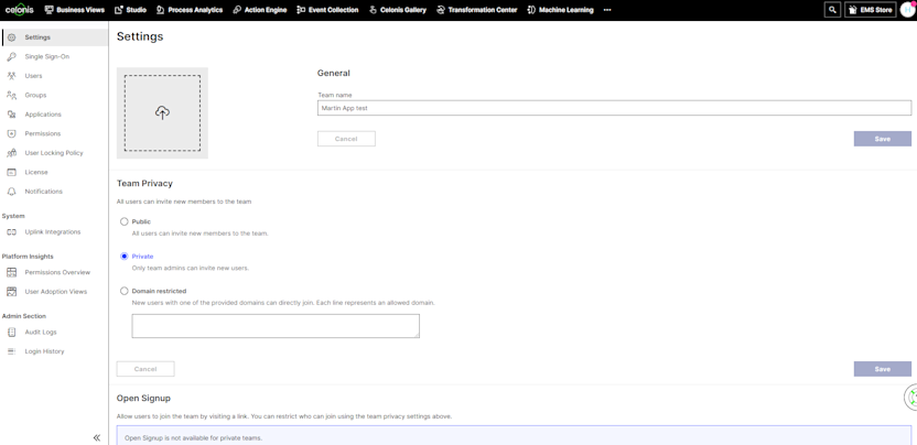
The first major update is the relocation of the Navigation Bar. Until now users found it at the top of the screen.

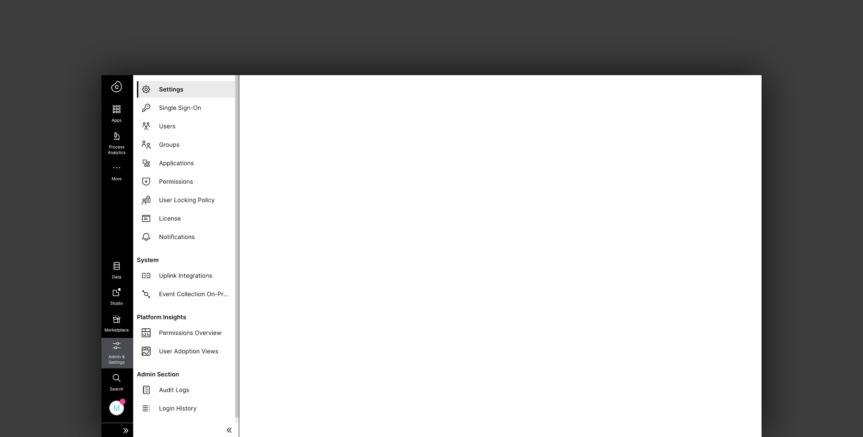
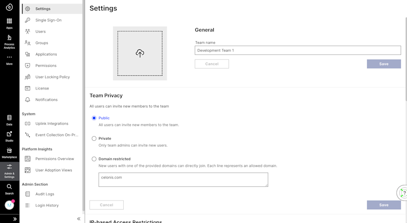
We have now moved the Navigation Bar to the left side of the screen.

Why? Placing the Navigation Bar here allows users to focus more on where they do their work, with the bar no longer obstructing the view.
We have some more in store for the Navigation Bar, and it will continue to evolve, providing features that let you personalize the experience and allow for faster access.
What’s in a name? Redefining the EMS taxonomy
We have introduced a new taxonomy to make it easier for EMS users to find what they need.
Old vs. new taxonomy below:
Business Views → Apps
EMS Store → Marketplace
Event Collection → Data Integration
Event Collection On-Premise → Data Integration On-Premise
Team Settings → Admin & Settings
Machine-learning → Machine learning
N/A → Data*
*Data is a new level one navigation menu item that groups services together.
We have also grouped standalone services (like Team Settings and Switch Teams) and rearranged others to make navigation more user friendly.
Enabling your team on these new changes
Head over to the Celonis Academy and find the corresponding “What's new” page explaining the differences between the old and new Navigation Bar and taxonomy!
As always, these product updates are based on conversations with our incredible global user community. We want to thank everyone who has shared their feedback with us, and we encourage you to do the same in the Celopeers community.


